
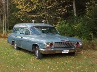
The gold leaf lettering on my 1962 C/B Chevrolet is coming off, since the glue has lost its adhesion. Now I am faced with replacing it, and I am leaning toward paint as a better solution. The vinyl letters don't look correct to me, so it is time to try something new. I am looking for suggestions and / or pictures of what might be period correct, and also be different. Below is a picture of the car with the present lettering.

You are using an out of date browser. It may not display this or other websites correctly.
You should upgrade or use an alternative browser.
You should upgrade or use an alternative browser.
Ambulance graphics
- Thread starter Paul Steinberg
- Start date
Rocky Fluegge
PCS Member
Paul go back and have it gold leafed, Any good sign painter pinstriper will be able to refresh up for you. With the group of pinstripes i hang with there are a couple that are out in your neck of the woods if you need me to get some names for you.
With the high price of gold today, putting gold leaf back on, isn't a great option, since it will only last about 5 years before it starts to peal loose. Real gold leaf is even more expensive than the vinyl gold leaf, and the installation of real gold leaf is becoming a lost art. It looks good from a distance, but up close it looks like what it is... vinyl lettering. Paint is forever, or just about. I am looking for ideas of what can be done other than just letters.
yes your right, in 1962 they would have used paint and not vinyl
they did a little over kill on the lettering when it was done. the size is bigger then the space. one thing with Steve and every one sharing there old pictures is you can see what the cars looked like in service. most were only town or service names on the door. funeral homes none. statements like radio dispatched or oxygen equipped was about it. along with the glass etching or decals.
Brendan Martin
PCS Member
Dig up one of your many coffee cans full of loot, and put the gold leaf on it.
Been looking for some pictures of "period correct" signage, but haven't found much. I am leaning toward something like
Air Conditioned
possibly with an igloo at the beginning of the "air conditioned, and a lightning bolt at the end of the "radio dispatched".
Air Conditioned
Radio Dispatched
The previous owner was a more is more guy. I too would dial things back.
Instead of "radio dispatched" you could go with the number for Sandy's answering service. It could be operated by Steinberg's towing or the Steinberg Mortuary. It's your car, have some fun with it!
Instead of "radio dispatched" you could go with the number for Sandy's answering service. It could be operated by Steinberg's towing or the Steinberg Mortuary. It's your car, have some fun with it!
good period correct "boilerplate" artwork
Paul-try phone books for the period. The display ads in the yellow pages have tons of "boilerplate" artwork that might interest you. Things like "air conditioned" and "radio dispatched" will have some neat artwork and will appear in a number of different classifications in the yellow pages.
Paul-try phone books for the period. The display ads in the yellow pages have tons of "boilerplate" artwork that might interest you. Things like "air conditioned" and "radio dispatched" will have some neat artwork and will appear in a number of different classifications in the yellow pages.
I have saved a lot of things in my lifetime, however, telephone books were not one of them. If you have any pictures I would love to have them. Please post or email them to me.. Thanks Paul
Update.......
Just spoke to the shop that fixed the dents on the car. Due to a miscommunication between the shop management and the techs, someone thought that the lettering should be removed. I now have a clean roof to start with... Now, I have to come up with a new design idea or leave it blank.........
Just spoke to the shop that fixed the dents on the car. Due to a miscommunication between the shop management and the techs, someone thought that the lettering should be removed. I now have a clean roof to start with... Now, I have to come up with a new design idea or leave it blank.........
Historical societies often have old phone books. Both white and yellow pages.
Dave Lisiecki
PCS Member
Somewhere I saved some "Radio Dispatched" artwork, but I can't remember where. I've seen this McCall photo McCall photo before, with rather large graphics (the EMS Classics photo site). Not sure who owns this one with a roof-mounted ball-mount whip (like mine had in the center of the roof). That's what I was able to dig up right now, anyway. Oh - You might try using the keyword search-function on the photo database of the EMS Classics website.
Attachments
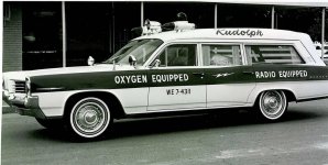
Rudolph Funeral Home's, Waxahachie, TX, 1964 Superior Consort Pontiac ambulance. (Dr. Mo photo)
Attachments
Wayne Krakowski
PCS Member
to dave Lisecki's post" not sure who owns this one" that is Robert L Smiths unit at last years hudson show,he brought the fleet with him.
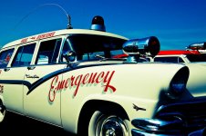
Just my opinion here, but when it comes to ambulance lettering, I'm not a big fan of large letters, or writing all over the car. I think it takes away from the car itself, and its classyness. However, i do like smaller lettering on the doors, and maybe even something else wrote in small letters somewhere else on the car. I do really like the look of gold leaf lettering, it gives it kind of a classy look. Again, just my opinion.
Josh
Josh
they did a little over kill on the lettering when it was done. the size is bigger then the space. one thing with Steve and every one sharing there old pictures is you can see what the cars looked like in service. most were only town or service names on the door. funeral homes none. statements like radio dispatched or oxygen equipped was about it. along with the glass etching or decals.
I agree with you Ed, but when you think about it how many ambulances did you see back in the day with red lensed and/or wig wag headlights, but now every other professional car ambulance restoration has them added even though maybe 1% of them did back in the day, if that.
My personal opinion is to make it as close to original as you can, which to me would mean paint. But I'm with Ed, adding "Radio Dispatched" and/or "Air conditioned" seems to be something more typical of what you'd see in an ambulance service's yellow pages display ad more than you'd actually see it on their cars.
Abe
Here is an idea:
I reproduced graphics on a nostalgic dragster a few years ago by melding old school style lettering with modern technology.
I computer cut paint masks then brushed One-shot enamel (still have some the good stuff before they ruined the chemisrty) in the voids. Best of both worlds.
You cant do gold leaf that way, but that doesn't seem like an issue anymore.
This is what I have been thinking of, since a couple of the gold leaf letters came loose. There is a local fellow that came over to look at the car, and suggested air brushing in the lettering and then a clear coat over it. The car was originally clear coated by Cottner Bevington after they did the conversion, since they couldn't match the factory applied paint. I would like something that is period correct, looks like it belongs, and will add to the overall look of the vehicle. Being blue, it looks more like an average station wagon without any lettering than it does as an ambulance.
phone books
Paul-Nearly every library has old phone books and they'll let you copy pages from it.
Paul-Nearly every library has old phone books and they'll let you copy pages from it.