Which Font?

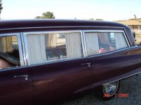
I am looking into ordering a name sign for my '72 Pontiac Superior and was wondering which font and size was the closest to the original most often seen in that era? I saw many choices on the Names Unlimited website.

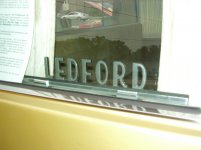
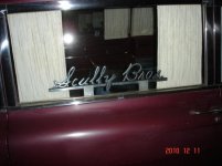
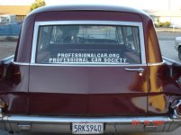
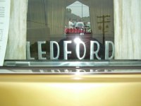
If possible, could someone post a close up of their metal window name plate?

Thanks
 
font

Terry: Do you have any pictures of cars run by your company in the early 70's and the door signage they might have had? If you do and provide them to Names Unlimited they would likely be able to make an exact match. They were able to do this for me.
They are extremely nice to work with and very reasonable in pricing and shipping.
My letter height is 2.5 inches though I am sure other members will have different sizes.
 
Most everyone around here ether used a polished 2.5 inch block font or a polished 2.5 inch Broadway font. Other popular name plate fonts are Old English, S&S style and script. I've got LEDFORD in the polished 2.5 inch Broadway font on both my cars. Both sets purchased from Names Unlimited!
 

Attachments

  • Snow White Sept 6, 06 070.jpg
    Snow White Sept 6, 06 070.jpg
    81.1 KB · Views: 175
  • Snow White Sept 6, 06 071.jpg
    Snow White Sept 6, 06 071.jpg
    83.4 KB · Views: 176
Last edited:
Tom at Names Unlimited is very helpful and great to work with. When I ordered my name plates, he first asked me what they were going to say, then he asked me what kind of coach they were going in. I told him they would be going in a S&S Victoria, and he suggested that I go with a 3 inch, because of the amount of letters I was using, and the size of the window opening. I was a little skeptical at first, because I thought they might be a little to tall, but when I got them, they looked great. And even better, he told me if I got them and thought they were to big, or just wasn't happy with them, to send them back and he would make me a new set.


Josh
 
Old pictures

I have a few old pictures from the early years here but it's not a close up. Thanks for the pictures. That is a big help. I'll see what I can get and call them as well.

Many thanks again!
 
At least around here, the block in 2" was the most common for ambulances in the late '60's and '70's. That's what I bought for mine, and that's what the original ones I have are.
 
Font

The script probably will not help any but it shows what the can do , the block style is S&S style . They can also do double stack and I think triple stack letters.
 

Attachments

  • DSC06888.jpg
    DSC06888.jpg
    32.7 KB · Views: 107
  • DSC01401.jpg
    DSC01401.jpg
    37.5 KB · Views: 106
  • DSC01399.jpg
    DSC01399.jpg
    41.3 KB · Views: 105
The script probably will not help any but it shows what the can do , the block style is S&S style . They can also do double stack and I think triple stack letters.

Actually, the Gothic style is the S&S style.

Superior used the broadway style.

As for the block style not sure if it was a specific builder, but it is said to be the easiest to read, old english is the hardest. I think 2" letters is a nice size.
 
Back
Top