JFK Pontiac ambulance up for auction

yes it is a shame that not one pictures was taken of the data plate with someones ring and finger or ID card in the frame.
but if any one has any pictures to post send them to the moderate. he will post them in the proper spot. it's our policy to only allow site supporters picture posting privileges. as they are paying the way for this site. not the membership of the club.

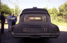
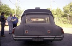
it was policy for out of service cars to have the ID number painted out. as this was the licence plate of the car. I have always thought that the back door (libary car) had been re lettered as all of it is in the painted (Gray) back ground. but we have a few members that do forensic for a living and they say there the same. having run the pictures threw there tests. but still they could have been, using the same type stencil being put right back over the original lettering when the Medical department was added. we know the BJ car is not lettered correctly. the dots on the U and S never appear on any government car. your surprised on the letters using a retired admirle, figure that one out. how could you make that mistake. to much education. Doc j did not letter the car. a check of the movie has reviled that this is the way Bob K's car which was the one used in the movie was lettered. be interesting to see if the the views on the back interior match up. they almost never do. even sold off a contract they were built different on the line.
 
In the first place, they most definitely are from two different typewriters. While the fonts are indeed close, the ones on the Shields typewriter have slightly bigger serifs than on the Hogan one. And the numbers are clearly different. Look closely at each number in each sample and it's obvious they are not the same. They were both also obviously produced on typewriters, as they are both mono-spaced font. Further, I'd attribute the difference in contrast between the two to one being an original, and one being a carbon copy. And that's as they should be. Note also that the Hogan letter--which appears to be a carbon copy--appears never to have been folded, while the Shields letter does. Also as would have been correct.

---

It may well be these are forged, but if they are, someone sure knew their stuff. To me it's amazing they'd think that all through so well and then get the size and font of the lettering on the car wrong.

---

(Edited to add: I meant to say regarding the letters that all of my observations are of course just about the physical qualities of the letters themselves. Obviously none of that explains why Hogan would have been involved two years past retirement. But it's also a puzzlement to me how a forger who would go to such lengths as to make these this well would have also made such a major blunder as that.)


Mike Adams

I saw the slight differences in serifs, but I counted that up to the difference in contrast. I chalked the difference in contrast as an attempt to make the letters appear as different as possible when they were scanned.

A carbon copy would most likely have 'hammer marks' from the edges of the rectangular typewriter hammers, and neither letter has these.

Also, I am now in full agreement with the person above who pointed out that both letters are too 'perfect', and may not have been produced on ANY typewriter. The lines are too straight, and all the letters are well-aligned.

As for the monospaced fonts, there are fonts available for Microsoft Word that perfectly replicate a monospaced typewriter. (I'll bet Dan Rather could have really used them...) Now, my curiosity is going to drive me to find the TrueType font that created these letters...

The Shields letter does contain marks near the trifold lines, but those marks look more like the kind of mark left behind by dirty photocopier wheels than by folds.

The car's lettering is obviuosly different, but this could be easily explained away (the car was repainted between then and now).

On the subject of motivation...taking a $25k car and turning it into a $500k car with a few pieces of paper and a Navy data plate sounds pretty motivating to me.

Quite honestly, I wish that the car were real, because then it would be a true piece of American history. But the truth is the truth.
 
David,

Also, I am now in full agreement with the person above who pointed out that both letters are too 'perfect', and may not have been produced on ANY typewriter. The lines are too straight, and all the letters are well-aligned.

Actually, these letters are hardly "perfect." Yesterday when I responded, I was only looking at your sample image. This morning I went back and looked at both letters in their entirety.

Just as an example of imperfection: In the Hogan letter, note the phrase "any and all information". Note that in each word, the first letter is misaligned slightly high with the rest of the word. Note also that if you look closely at many individual characters in the Hogan letter--such as the two f's in "office" you can see artifacting at the bottoms of them that are consistent with residue left on carbon copies.

I'm no spring chicken, and I've been in the business of ink on paper all my adult life, and the more I look at both these letters, the more I'm convinced the Hogan letter is a carbon copy, the Shields letter is an original, and they are both not computer generated, and not printed on a laser or inkjet printer.

Look--for instance--at the 6's in the Shields letter. They are not all identical. And the differences are really only attributable to striking differences--just exactly how the ball struck the ribbon and pressed it into the paper. Such differences are impossible on a modern inkjet or laser printer.

Further, while it's impossible to say for certain, the type on the Shields letter certainly appears to me to he "haloed" as if it was struck. ("Struck" meaning printed with a raised surface--such as a typewriter key or ball.) Also impossible on an inkjet or laser printer.

Also, my guess is the difference in contrast--and most likely the serifs as well--is caused by the Shields letter being an original, and the Hogan letter being a carbon copy.

Finally note the correction of the c in the word 'can' on the Shields letter. That's just backing up to make a correction on a typewriter. It'd take some effort to create on a computer. Why bother?

My bet is that both of these letters were produced on an IBM Selectric. Not only was that machine just about ubiquitous at that time, but it was certainly capable of producing all of the characteristics of the type in both of these letters.

It also appears to me that if you look at the horizontal alignment, the Hogan letter overall isn't as good as the Shields letter. Many words have their first letter slightly offline and high. Hard to say and it could be the carbon, but for that reason, I'd still come down that these are two different machines.

All that said though, after looking over both letters in more detail it's obvious the Hogan letter at least is definitely fake. The type around the signature is obviously from an original. It compares almost perfectly to the Shields, letter. Maybe that's why the forger used his name: maybe they were able to get--or had--an original copy of his signature.


Mike Adams
 
in actuality the car is real a vary real and nice example of a 1963 military Pontiac built by superior. if this one is lost to us it will be a big loss. had it been the Kennedy car having carried him for 10 min twice would be nothing to the number of wounded sick and in need of care Sailors it carried in it's life time. people it help to heal and get on with there life. it being use for transporting the dead president was at the whim of his wife who was in a position to get what she asked for despite the regulation of using a ambulance for a Hearse.
it's value to us lays in what it is, not who it may have had in it for a brief period of time. most of these cars were sold at auction bought by privet squad and used up, tossed aside. they were cheap cars to get and as such went to people that could only afford that price of car. the HX behind how this one survived up to now only to end up in a big lie, is one I hope the new owner is able to unravel. it will all depend on how she chooses to display the car whether is is a important piece of automobile Hx or a morbid piece of curiosity for people to wounder over. a lot of that will depend on her interpretation of the cars value to her. but I still say if you look on the radiator support you will find the Navy Serial number of the car. it was painted on there to. as sloppy as these guys were if it had worn off enough so it was hard to read I'll bet you can still see it in a side light.
 
I have been fascinated by your thread here since the day before the auction. I commend you all on the dogged determination to reveal the true facts (whatever they may be). I have some additional thoughts, observations and questions:

- Does anyone have a buddy that can run VIN searches in the CA DMV records? If the vin of the auction car shows up as formerly owned by Mr. Kossoff, then that would eliminate any remaining questions about that.

- If a vin search can’t be done to lay that question to rest, then in addition to all the similarities (if not “identicalities”) between the Kossoff / CVC car and the BJ auction car noted in the thread above, if you look at the pics of the passenger side front fender (the ones shot from the front corner angle) posted early in the thread, in the fenderwell behind the tire they both have the very same blob of undercoating near the bottom, in the exact same position and shape, and covered by the exact same pattern of gray paint overspray. Seems pretty hard for that to be a coincidence.

- I also noticed in the BJ auction that the forward section of the roof of the auction car appeared to have the same slightly darker shade of gray as the passenger side front fender and door do. That would make sense if the two extra roof lights were removed from the Kossoff / CVC car at the same time as the fender siren was removed, and all the affected sheet metal repaired and repainted out of the same batch of paint. Not sure why the door was repainted too, but maybe it had a scratch or dent that they decided to take care of at the same time.

- Does anyone in PCS know how to make a FOIA request (or know an attorney who knows how to do it)? Maybe it would not be too hard to specifically request only the two letters in question (by date, sender and recipient), so that you get back only the items in question and not 10K pages of stuff to sift through. That way if the letters were real you would receive from the gov't a copy of the exact same thing that the Dr was using to try to authenticate the car. Or if the letters were real but altered in some way after being mailed out by the gov't (changed Pontiac vin # for example), then you’d get the unaltered version from the gov’t (and then you’d also know the likely true vin # of the car in the crusher). Or if the letters never existed in 1963, you’d get an answer back from the government that the two requested documents do not exist.

- Also, I wonder if the government’s responses to other peoples’ prior FOIA requests are a matter of public record themselves, so that they can be requested too? If that were the case, then a FOIA request could be sent in asking for copies of all FOIA requests (if any) sent in by the Dr. in the last two years (or however long he owned the car), and copies of all the government’s responses to those requests. That way, you’d know for sure whether or not there ever was a FOIA request made, and you’d find out exactly what the ENTIRE and actual response was (including cover letters, or “nothing found” notices or the like).

- Either or both of those types of FOIA requests would lay all questions about the letters to rest once and for all, it would seem.

- As to discussions about the tailgate of the crushed car, I noticed the odd looking appearance of the gray around the writing too. I wonder if the Navy applied any sort of cleaner or solvent to the paint before spraying the ID #'s on the cars when they were new, which (although not noticeable when the car was a few months old) might have caused the gray paint to degrade over the decades? But one thing is for sure, if the crusher car was not the actual JFK car, then the folks at the JFK library must have had a crystal ball to know in the 1980's they needed to fake the death of a 63 Pontiac for the purpose of discrediting the BJ auction car in 2011! With due respect to all Conspiracy Theorists, I can't image that they would have gone to the trouble to fake the crusher scene in the 1980s rather than just going out and ACTUALLY finding the real car and crushing it.

Anyway, thanks and keep up the good work!
 
What Mrs.allan should do is find out if it in the movie and advertise it for that,and check to see if it real or not, then take me out for lunch but that is another subject.lmao
 
With due respect to all Conspiracy Theorists, I can't image that they would have gone to the trouble to fake the crusher scene in the 1980s rather than just going out and ACTUALLY finding the real car and crushing it.

Personally, I have very little use for any conspiracy theories, but it's not all that hard for me to imagine some scenario in which they might have crushed the wrong car. Supposedly this thing was in service for 16-17 years after the assassination, and in that time it must have been pretty infamous among the men who drove it. Maybe someone stole the thing. Or maybe someone just screwed up. I have no idea. Maybe the car got sold at some point and someone was just covering their butt.

My guess is that they probably did crush "the" car. It's just that until it's proved, there is that little bit of doubt.

And regarding proof, I was asked the other day if I could upload a screenshot of the Photoshop manipulation I did comparing the back doors of the junkyard car and the Andrews car.

I don't know why it didn't dawn on me I could just upload them myself and provide a link.

So here it is: Ambulance door comparison.

Mike Adams
 
Folks, I tried to upload the original photo from the Kennedy Library of the back door of the crushed ambulance. It's too large to upload directly onto this site. So I've uploaded it to Photobucket and linked it below. Let's see how that works.

I do see the area around the lettering. I wonder, since it sat in a warehouse for many years, if that's not just somebody wiped years of dust off around the lettering, but didn't bother to wash the whole car immediately prior to scrapping it.

Also, regarding the above post, the ambulance wasn't in service for 16-17 years. We have a document that, as early as 1974, preservationists had set the ambulance aside while determining what to do with it. It seems they took great care to keep track of it.

NLJFK86-C34A-18.jpg
 

Attachments

  • NLJFK86-C34A-18.jpg
    NLJFK86-C34A-18.jpg
    83.7 KB · Views: 69
Steve, thanks for posting a bigger version of the picture. In the smaller version that I saw before, I didn't notice this, but does the back door have a big dent in it? If that's the case, that might be why the numbers weren't aligning completely when Mike did some Photoshop manipulation to compare them.
 
When they wiped the dust off the numbers on the rear door they may have grabbed up a dirty shop rag that had oil or grease on it that may have given the area around the numbers that apperance as well as it soaked up in the dulled down weathered paint when rubbed across the door. Also I don't see any evidence of an antenna being mounted on the LH quarter window filler panel ether on this car.
 
can you say photoshop. sorry I did not think of wiping off the dust to account for the difference in color. with just a photo you can't tell but a wet rag would account to it. so who's dealer tag is that. in Sd they have a number on them. Steve Can you post a pictures of the one showing the serial number of the car??
 

Attachments

  • NLJFK86-C34A-18.jpg
    NLJFK86-C34A-18.jpg
    79.3 KB · Views: 438
Folks, I tried to upload the original photo from the Kennedy Library of the back door of the crushed ambulance. It's too large to upload directly onto this site. So I've uploaded it to Photobucket and linked it below. Let's see how that works.

I do see the area around the lettering. I wonder, since it sat in a warehouse for many years, if that's not just somebody wiped years of dust off around the lettering, but didn't bother to wash the whole car immediately prior to scrapping it.

Also, regarding the above post, the ambulance wasn't in service for 16-17 years. We have a document that, as early as 1974, preservationists had set the ambulance aside while determining what to do with it. It seems they took great care to keep track of it.

That pic is more than enough to convince me that the pic was NOT altered by the Kennedy library. And if they were going to alter it to try to fool someone, why would they add the Medical Department line not seen in 1963?!?

Also, on the link posted above trying to overlay the two images, with the differing angles and the fact that the farther up the image you go the less the door seams match, means (in my opinion) that the small difference in the overlay of the numbers is just the angles and different camera lenses at work. I don't think it suggests the lettering was "redone" at some point.

:myopinion:
 
Also, on the link posted above trying to overlay the two images, with the differing angles and the fact that the farther up the image you go the less the door seams match, means (in my opinion) that the small difference in the overlay of the numbers is just the angles and different camera lenses at work. I don't think it suggests the lettering was "redone" at some point.

Of course you're entitled to that opinion, but it simply isn't true.

If you draw a horizontal line through the lettering of the number line from side to side, that line clearly is not distorted at all by lens angles, and that line is the only line that matters. In other words, along that line, the type itself, the left door seam, and the right door seam all line up perfectly, and move in proportional relationship to each other. If there were distortion involved, that would not be possible.

Further--while it's hard to see in that image--the two crosses on the bottom of the door align correctly in the overlay where the door seams all align but the type is off. In the overlay where the type aligns but the door seams are off, they are clearly out of position by am identical distance as the door seams to the left.

Also further, there is the issue of the type itself. As I said at some earlier point, it also does not align exactly to itself. On the junkyard car, the last three numbers run slightly downhill. On the Andrews car, not only do they not, but the first 9 in the numbers after the hyphen is slightly raised compared to the others.

I will note that on seeing the larger image of the junkyard car, I think the areas of darker color are just shadow caused by dents, and not paint, as they appeared in the smaller image. However the dents are not deep enough to have caused the offset of the lettering. For them to be, at least one door seam would have had to have been moved by an equal measure.

My observation in all this is this: As I said, I didn't have any agenda when I set out to do that little test in Photoshop other than to see if I could do it. I was actually kind of surprised it worked as well as it did. I had no axe to grind and it convinced me.

However, all it convinced me is that if the junkyard car is the Andrews car, that it had been renumbered at some point. That's hardly a stretch.

It's also hardly a stretch to note what inconsistencies do exist in the junkyard car. Most likely there's an explanation for them, but if there is, where is it?

I'm afraid that as far as I'm concerned, it's a bit of semantics to say whether the car had been in service for 11 years, or for 16-17 years. Either is a long time. I also note that the junkyard car appears to be missing the center piece of its horn ring, as well as its nomenclature plate, and even a vent wing. Why? Souvenirs taken by someone? I don't know and I don't claim to know. I do know this appears to be a car that did not live an easy life, and looked pretty used up, regardless of how long it remained in service.

What I see here however, and quite frankly, is some of exactly the same issue I saw with Jackson and Davis. Some of you guys have so completely hardened your opinions that you're looking to every piece of evidence to fit your view of the facts, and have ceased to be objective.

And I've learned over the years that whenever you're involved in a discussion with people who have reached that stage, it's time to bow out.


Mike Adams
 
I came back to edit this but edits aren't allowed after thirty minutes it appears. I did want to correct a brain-fart from above, however. The first 9 after the hyphen on the junkyard car isn't higher than the rest of the line, it's lower.


Mike Adams
 
don't bow out everyone has there own opinions and as to why but it's all moot as we don't have any originals for the documentation or either car to examined. but the interesting things is other then the back door shot the library can't prove they more then then crushed a car. the letters are so obvious fakes. I wondering how much Dr.J paid for them. everyone from a number of angles has picked them apart no one thinks they are real. the car sold a BJ and Bob K car have to much in common not to be the same car. I think this much everyone has agreed on.
you either Like BJ and think they are the best authority or you Don't. either way they have drop a notch or two for everyone over there handling of this car.
the film strips posted show the libary striped and crushed the car they started out with. the navy supplied them with that car. as for the 15 cars built. that number was supplied to us from BJ. so to me it has always been in doubt. maybe 15 navy 15 army and 15 air force?? who knows if each branch ordered they own you'll never know there are no records from superior from 63.
so for me it stands, the navy gave the reported car to the library they crushed that car. the admiral was not working in that position at the time of the letter he supposed to wrote to superior. the return letter from superior is written on the same letter head as a 1951 letter a member has. no one has checked if the signature was from a man working in 63. the car sold at BJ is to close to Bob K car not to be that car. Dr J is not saying were he got the car or the letters. the library is up front on there car. so that's about it.

any more is just going over plowed ground. proving a point all ready made. it will be up to the new owner to trace her car back. we hope to the navy and it's place of service. I don't think that any one is now 99.9 % sure of the car sold at BJ. I'm at least 90% sure of the one crushed by the library. for reason all ready stated. BJ must be to or they would not have blocked out the lettering on there picture of the library car for there crowd to see. we know Bob's car was titled in CA the library car most likely never was. DrJ most likely in Ka but I have never see it with a tag on it. all these are avenues for her to trace out. so if she wants to there is a good chance she can. but for me, it'll be again next year at BJ the talk about the Buddy Holly olds and the JFk ambulance. this will stay with them for a long time.
 
No offense to anyone putting a lot of effort into this rear door numbering thing, but in my opinion you can't make any kind of worthwhile comparison comparing a photograph taken in the eighties to a still from a video image taken in the early sixties. If both were photographs, maybe, but the television technology in the sixties was such that, at any given second, there could be any of a number of different types of distortion in the image. Lens distortion, rippling, rolling, interference, etc. Sometimes it was obvious to the point of not being able to see the image, but at almost any time there was bound to be at least a little distortion in the image somewhere. This would be even more prevalent if the image was being transmitted somewhere. To try to make a comparison from two such images seems like it would be fruitless.
 
Well, since I was asked not to bow out...

No offense to anyone putting a lot of effort into this rear door numbering thing, but in my opinion you can't make any kind of worthwhile comparison comparing a photograph taken in the eighties to a still from a video image taken in the early sixties. If both were photographs, maybe, but the television technology in the sixties was such that, at any given second, there could be any of a number of different types of distortion in the image. Lens distortion, rippling, rolling, interference, etc. Sometimes it was obvious to the point of not being able to see the image, but at almost any time there was bound to be at least a little distortion in the image somewhere.

That's all fine in theory, but it's just that, theory. And it might even be true in some theoretical construct.

But this isn't theoretical. There are two actual images, and they can be compared. And here's what a comparison shows:

The first interesting fact is that the easiest way to make the overall image of the two type lines match is to line up the top, bottom and side door seams. Do that, and the type sizes and left to right spacing fall just as close on as you see in my demo. I didn't alter them at all.

Since I think all will agree that the dead-on photo of the junkyard car is dimensionally correct, then that means that in order for lens distortion to be responsible for the type misalignment between the two images, there would have to be a distortion the width of a character of type somewhere in the Andrews image either to the left or the right of the lettering that's there, but not otherwise visible.

Okay, so how big would that have to be?

Not hard to figure. There's a license plate in the image, and license plates are 6"x12". So using the license plate as a guide, I make the door 52" wide, and the individual type characters 1.25" wide. 1.25 inches comes out to 2.5% of 52 inches, so that sounds at least plausible. However, there's the little problem that the type, once the seams are aligned, is exactly the same width in both images, so unless there's distortion through the type that proves the type was repainted in and of itself, there's no distortion horizontally across the type. So what's left would be distortion on either side of the type.

The type line is about 20 inches long, so there's roughly 32 inches of total unpainted space, or 16 inches on either side. The distortion would have to be on one side or the other, and 1.25 is 7.8% of 16 inches. So, you'd be looking at a distortion on one side or the other of the type, localized, of nearly 8%. A distortion that's so localized that it affects no other elements.

Again, if you want to believe that, I'm not about to stop you. But to me, that's pretty unrealistic. The much more likely explanation, if this is indeed the Andrews car, is simply that at some point in 11 years the door was repainted.


Mike Adams
 
Indeed there is. However, whatever effect it would have had on the type, would be to pull it to the left--the opposite way from which the type is actually off. It's also hardly deep enough to move the type the required 1.25 inches.
 
Back
Top