You are using an out of date browser. It may not display this or other websites correctly.
You should upgrade or use an alternative browser.
You should upgrade or use an alternative browser.
Why do we have....
- Thread starter Richard Vyse
- Start date
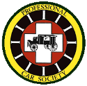
It may be fair to say that the coach in our logo is a heraldry symbol of the funeral profession. Logos and branding evolve to keep pace with the times, this is true of both business and govenment. The question is; do we want our logo to change to reflect motorized professional vehicles?
John ED Renstrom
PCS Member
then answer is those that forget the past have doomed their own future.
custom coach work is what we admire and the biggest hit at any meet is the horse drawn rigs. which all our motorized cars have descended form. why would we turn our backs on our foundation.
custom coach work is what we admire and the biggest hit at any meet is the horse drawn rigs. which all our motorized cars have descended form. why would we turn our backs on our foundation.
then answer is those that forget the past have doomed their own future.
custom coach work is what we admire and the biggest hit at any meet is the horse drawn rigs. which all our motorized cars have descended form. why would we turn our backs on our foundation.
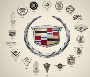
We need not turn our backs to our origns to modernize our logo. As an example; Cadillac has changed its coat of arms while still retaining its link to the past.
Attachments
Last edited:
Wait, aren't we into horse drawn hearses (and ambulances) too? Seems like the horse-drawns attract a lot of attention anywhere we go/show. We always like to look at them when we visit somewhere else, like a funeral home with a restored horse-drawn.
You know what? We even have a judging class for horse-drawns!
So they belong, just like anything else. True, we have more "cars" than horse-drawns. But that's what makes them even more interesting, right?
One other thing. Most horse-drawn hearses are of a very similar style, and the basic outline of a horse-drawn hearse is pleasing to all. So, if we put a motorized car, what year? Landau or limousine-style? Do we use a Superior, Cunningham, Miller, Meteor, Miller-Meteor, Eureka, S&S, Henney, Flxible, Economy, Comet, Cotner-Bevington, Pinner, Memphis, ACC, Thacker, AHA, Eureka (McPherson-era), Eagle, Accubuilt, or something else? Cadillac, Packard, Pontiac, Chevrolet, Buick, Olds, Ford, Lincoln, Studebaker, etc.? Oh, that's a fight you don't want to start there.....
You know what? We even have a judging class for horse-drawns!

So they belong, just like anything else. True, we have more "cars" than horse-drawns. But that's what makes them even more interesting, right?
One other thing. Most horse-drawn hearses are of a very similar style, and the basic outline of a horse-drawn hearse is pleasing to all. So, if we put a motorized car, what year? Landau or limousine-style? Do we use a Superior, Cunningham, Miller, Meteor, Miller-Meteor, Eureka, S&S, Henney, Flxible, Economy, Comet, Cotner-Bevington, Pinner, Memphis, ACC, Thacker, AHA, Eureka (McPherson-era), Eagle, Accubuilt, or something else? Cadillac, Packard, Pontiac, Chevrolet, Buick, Olds, Ford, Lincoln, Studebaker, etc.? Oh, that's a fight you don't want to start there.....
Horse drawn hearses and ambulances are where Professional Cars originated from. I personally like the horse drawn hearse in our logo.
Josh

Josh
Mike Burkhart - Deceased 1948 - 2016
December 30, 1948 - October 21, 2016
Let's not take Grandpa's picture off the wall yet..............:Exclamation:
Jonathan Murphy
PCS Member
Well, as I have seen in the past with other organizations, once you decide to change the logo to reflect a motorized hearse, the argument then becomes "which year of car?". Then it goes to "which coachbuilder?", "which chassis?" and then on from there. For my 2 cents worth, having a non-descript horse drawn hearse eliminates all those questions and potential arguments.
The logo always made sense to me being that it is pretty much a staple for funeral history I would assume. Of course we all know what happens when one makes an assumption!
Darren Bedford
PCS Member
That is the official stamp or logo of the club.
Sounds like most people who posted so far like it and are happy with it.
I don't know who created it ? George Hamlin maybe ?
I think there could be some variety and I would be up for some other images of a hearse or ambulance or both on a T-shirt to promote the club.
We could have the official logo somewhere on the shirt as well for historical purposes.
As long as it was done well, I would wear something like that.
Darren
Darren Bedford
PCS Member
Can someone tell us who designed the logo and explain how the logo was created ?
There is a hearse in the middle...
There is a red cross in there as well, meaning ambulance I guess...
There is what appears to be a wagon wheel with spokes around the hearse and red cross...
With the club name written out.
Sometimes if you understand why or how it was made up, it helps understand it.
I hope someone can fill us in on who and how it was made up.
Was it designed and in place since the beginning of the club ?
I think this is info we should all know anyway.

Darren
There is a hearse in the middle...
There is a red cross in there as well, meaning ambulance I guess...
There is what appears to be a wagon wheel with spokes around the hearse and red cross...
With the club name written out.
Sometimes if you understand why or how it was made up, it helps understand it.
I hope someone can fill us in on who and how it was made up.
Was it designed and in place since the beginning of the club ?
I think this is info we should all know anyway.

Darren
Kevin M. Parkinson
PCS Life Member
So, if we put a motorized car, what year? Landau or limousine-style? Do we use a Superior, Cunningham, Miller, Meteor, Miller-Meteor, Eureka, S&S, Henney, Flxible, Economy, Comet, Cotner-Bevington, Pinner, Memphis, ACC, Thacker, AHA, Eureka (McPherson-era), Eagle, Accubuilt, or something else? Cadillac, Packard, Pontiac, Chevrolet, Buick, Olds, Ford, Lincoln, Studebaker, etc.?
1972 S&S Cadillac Victoria Landau! Or just leave it as it is.... I like it.
Brady D Smith
PCS Life Member / PCS Past President
What Mr. Lichtman and Mr. Burkhart said.
I agree completely.
I agree completely.
Sometimes change is good. Like our Michigan Chapter. We took the "Mid" off because, at the time we took it off, we represented all of Michigan and the UP. We also changed our logo to include the UP because we have two members from the UP.
As far as the International logo goes, I like it.
As far as the International logo goes, I like it.
Rick Franklin
PCS Member
Oh come on! The logo represents where professional cars have come from. This is like questioning WHY we have 13 stripes on the American flag! Its a generic image of the origins of the motorized funeral coach. Theres more important issues to deal with than this.
Great responses but please do not misunderstand the post. It's a question which I'm sure has come up before.
I'm not suggesting the logo be changed in any fashion.
I'm not suggesting the logo be changed in any fashion.
John Royark JR
PCS Member
Can someone tell us who designed the logo and explain how the logo was created ?
There is a hearse in the middle...
There is a red cross in there as well, meaning ambulance I guess...
There is what appears to be a wagon wheel with spokes around the hearse and red cross...
With the club name written out.
Sometimes if you understand why or how it was made up, it helps understand it.
I hope someone can fill us in on who and how it was made up.
Was it designed and in place since the beginning of the club ?
I think this is info we should all know anyway.
Darren
Darren, no the logo was not there since the beginning. I have the first issues of TPC, and in them they had a contest for the creation of the logo. Over a few issues, they showed members ideas and voted on the one we use today. I would dig them out and post them here, along with the winning name but they are in a box that is way over my weight limit to get them down after my recent surgery. I will get to them as soon as I can get help going through them.
John Royark JR
PCS Member
Darren, no the logo was not there since the beginning. I have the first issues of TPC, and in them they had a contest for the creation of the logo. Over a few issues, they showed members ideas and voted on the one we use today. I would dig them out and post them here, along with the winning name but they are in a box that is way over my weight limit to get them down after my recent surgery. I will get to them as soon as I can get help going through them.
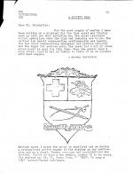
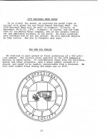
Dug out the old mags. I guess there really was not a contest, but a member submitted their idea and other ideas were welcome. They voted on the one we see now and was made official at the annual meeting in 1978.
The first mention of the seal is in issue 2 winter 1977, and the only other mentions are in issue 8, summer 1978. I thought there were more drawings but couldnt find any.
The current seal is known throughout the world and hobby, I see no need to change or update it in any way.


Ah. Design by committee. :drama:
Kent Martinson - Deceased 1947 - 2019
December 7, 1947 - February 19, 2019
Ah. Design by committee. :drama:
For God so loved the world that he didn't send a committee.


