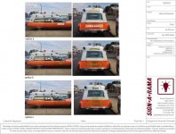
Was just sent some mock-ups for my rig. Don't really like any of them with the exception of exhibit A window graphic with the word " ambulance" inset into stripes......cross needs to be colored. Script writing doesn't do it for me nor the ornate borders. Back to the drawing board.
You are using an out of date browser. It may not display this or other websites correctly.
You should upgrade or use an alternative browser.
You should upgrade or use an alternative browser.
Body/window graphics
- Thread starter Mike McGeehan
- Start date
Have you considered having the window decals redone in their original design, either standard short (rear side windows only) or optional long (rear and center door) version?
Darryl Thompson
PCS Life Member
Was just sent some mock-ups for my rig. Don't really like any of them with the exception of exhibit A window graphic with the word " ambulance" inset into stripes......cross needs to be colored. Script writing doesn't do it for me nor the ornate borders. Back to the drawing board.
If a sign shop or one of my designers sent me a proof like that, I think I would :14_6_12:
God the borders made me want to lose my lunch. IMHO
Man I'm sorry for the designer, they should have given more thought and respect to your rig. Even as a sample setup on paper.
Curious as to what specifically you asked for to receive those examples.
Was just sent some mock-ups for my rig. Don't really like any of them with the exception of exhibit A window graphic with the word " ambulance" inset into stripes......cross needs to be colored. Script writing doesn't do it for me nor the ornate borders. Back to the drawing board.
I think they stole (ok "borrowed") the middle graphics from the Dodge Lil Red Express trucks that were popular in the late 70s.

Curious as to what specifically you asked for to receive those examples.
I provided this as example of what I found I liked as a door emblem and asked they provide variations. I want uniqueness while still retaining classic look. That's harder than it sounds.
Attachments
Tim Prieur
PCS Member
Mike, If I could echo Steves comments about the window decals. For the doors, 2 and 3 are pretty busy. I would favor #1, but see if other members could come up with some other possibilities. I will try.
Keep in mind that if you put a lot of external decals on the paint, you might lessen the chances of it being used in a movie. All the ambulances in movies that I have seen are usually plain on the outside.
A company like Sign-A-Rama applies graphics to fleets of modern rescue vehicles. IMHO (and carrying a degree in Graphic Design) they applied what they know to your MM which does not fit vintage. Yeah, they tried on window graphics but still a fail.
There's nothing wrong with using traditional MM window graphics. Don't recall ever seeing optional long version in person that Steve Loftin mentioned, so maybe that would be your uniqueness answer.
If you really wanted unique however you wouldn't have chosen oh-so-popular Omaha Orange. Gold (leaf included) is inherently gaudy. Another piece of your 'unique' puzzle can include silver leaf (actual, not vinyl) on a door logo, which would really pop burnished on an orange base. Find an exact style of logo desired, figure out what you want your rig to say, and give those two criteria to designer. Take guesswork out and don't waste designer's time trying to figure out what you want.
Leave other graphics (rear) off entirely. Too busy. Less is more. (<---That's classic.) You don't want your rig looking like it was just accessorized at Pep Boys, do you?


